













Discover how Website Design combines strategy, user experience, responsive layouts, SEO, content, accessibility, security, performance, and conversion principles to create a high-performing website built for sustainable growth.
Introduction
A modern website is much more than a collection of attractive pages. It is a digital environment where potential customers discover a business, evaluate its credibility, understand its products or services, compare alternatives, find answers to questions, and decide whether to take action. Effective Website Design therefore requires much more than choosing colours, fonts, images, and layouts. It requires a strategic combination of user experience, content architecture, technical performance, search visibility, accessibility, security, conversion optimisation, and business objectives.
A website can look impressive and still perform poorly. Visitors may leave because the navigation is confusing, important information is difficult to find, pages take too long to load, mobile layouts are uncomfortable, forms are unnecessarily complicated, or the messaging fails to explain the value of the business. Conversely, a relatively simple website can perform extremely well when it is built around clear user needs, strong information architecture, useful content, trustworthy communication, and reliable technical foundations.
For businesses planning a new website or redesign, the most important question should not be, “How can we make the website look modern?” It should be, “How can we create the most useful experience for the people we want to reach?” That shift in thinking changes the entire design process.
At MyBlogPoster, a strategic approach to Website Design should connect business goals with audience expectations and measurable outcomes. Google’s current guidance emphasises people-first content, overall page experience, technical quality, and genuine value rather than creating pages primarily to manipulate search rankings.
This guide explains the major principles behind high-performance websites, from initial strategy and UX through responsive design, visual systems, website architecture, content, and SEO. Part 1 focuses on the strategic and structural foundations that should be established before a website is launched.
Understanding the Foundations of Effective Website Design
Effective website creation starts by understanding why the website exists. A business website may be intended to generate qualified enquiries, sell products, establish authority, educate an audience, support existing customers, collect leads, promote services, or provide information. These objectives should influence every major design decision. A lead-generation website needs a different structure from an online publication, ecommerce store, membership platform, or technical knowledge base. Designing without defining the purpose first often produces pages that look polished but do not perform a meaningful business function.
The next foundation is understanding the audience. Visitors arrive with different levels of awareness, expectations, questions, and intentions. Someone discovering a company for the first time may need a simple explanation of its services, while an informed prospect may be looking for pricing, case studies, specifications, reviews, or implementation details. Strong user-centred design considers these different needs instead of assuming every visitor follows the same journey. Research can come from customer interviews, sales conversations, support enquiries, website analytics, search queries, competitor analysis, and feedback from existing users. The objective is to replace assumptions with evidence wherever possible.
A third foundation is defining measurable success. A website should have meaningful performance indicators rather than relying entirely on subjective opinions about whether it “looks good.” Depending on the business model, these indicators could include qualified enquiries, completed purchases, consultation bookings, downloads, newsletter registrations, returning visitors, engagement with important pages, or successful completion of key tasks. Technical indicators such as accessibility, page performance, mobile usability, and security also matter. Google’s guidance makes clear that there is no single page-experience factor that guarantees search success; instead, website owners should consider the overall experience provided to visitors.
A useful Website Design project therefore begins with four questions:
- What business outcome should the website support?
- Who is the website primarily serving?
- What information or functionality do visitors need?
- How will success be measured after launch?
Answering these questions before visual design begins creates a much stronger foundation for everything that follows.
Building a Website Strategy Before Starting the Design
A successful website should be strategically planned before individual pages are designed. Website strategy creates the framework connecting the business model, target audience, content, functionality, SEO, customer journey, and conversion objectives. Without a strategy, design decisions often become subjective. One stakeholder may want a minimalist layout, another may prefer a highly visual interface, while a marketing team may want additional landing pages and a developer may identify technical limitations. A documented strategy gives everyone a common direction.
The first step is usually defining the website’s core positioning. Visitors should be able to understand what the business does, who it serves, and what makes its offer relevant. This does not mean filling the homepage with exaggerated claims. Strong positioning is specific and understandable. A company offering website development, for example, may need to explain whether it specialises in ecommerce, corporate websites, lead generation, technical platforms, redesigns, or a particular industry. Clear positioning makes navigation, content planning, calls to action, and visual communication easier.
The next step is mapping the customer journey. Think about how a person discovers the business and what they need at each stage. An individual searching for general information may need educational content before being ready to contact a provider. Someone comparing providers may need service details, evidence, pricing information, case studies, or answers to objections. A visitor who already knows the company may simply need fast access to a contact page. This is where contextual internal linking becomes valuable because related pages can guide users naturally toward the next useful destination.
Website strategy should also include a content inventory, competitor review, technical requirements, integration requirements, accessibility expectations, analytics requirements, and future expansion plans. Google recommends using SEO in support of people-first content rather than treating search engines as the primary audience. A strong strategy therefore balances discoverability with usability.
Businesses should also decide what belongs on the website now and what can be introduced later. Trying to build every possible feature at launch can increase complexity, cost, maintenance requirements, and performance problems. A focused first release is often more effective when it contains the pages and functionality necessary to satisfy the main customer journeys.
Creating a User Experience That Makes Websites Easy to Use
User experience, commonly abbreviated as UX, describes how effectively visitors can understand and interact with a website. Good UX removes unnecessary friction. Visitors should know where they are, understand what a page is about, recognise available actions, and be able to move toward their objective without unnecessary confusion. The interface should support the visitor rather than requiring the visitor to learn how the website works.
Navigation is one of the most important UX components. Primary navigation should contain meaningful labels that communicate what visitors will find. Labels such as “Services,” “Products,” “Resources,” “About,” and “Contact” can be effective when they accurately represent the underlying content. More specialised websites may require category structures, filters, search functions, breadcrumbs, or secondary navigation. The correct approach depends on the website’s size and purpose, but the principle remains consistent: navigation should reflect the user’s mental model.
UX also requires careful attention to page hierarchy. Important information should receive appropriate visual emphasis. Headings should establish clear relationships between sections, while supporting information should remain available without overwhelming the visitor. Buttons should look like actions, links should look like links, and interactive controls should behave consistently. A visitor should not have to experiment with the interface to discover what is clickable.
Forms provide another common source of friction. Asking for unnecessary information can reduce completion rates, especially when a visitor is simply requesting an initial conversation. Fields should therefore be selected according to the purpose of the form. Validation messages should explain problems clearly, and successful submission should provide an understandable confirmation.
Accessibility is also part of UX. Keyboard navigation, readable typography, sufficient contrast, descriptive labels, focus states, and semantic structure can improve the experience for people using different devices and assistive technologies. accessibility guidance
Ultimately, successful UX is about reducing effort while preserving clarity. A website should not merely provide information; it should help visitors accomplish meaningful tasks.
Developing a Strong Visual Design System and Brand Experience
Visual design determines how a website communicates personality, hierarchy, professionalism, and emotional tone. However, effective visual design is not simply about selecting attractive colours or following the latest design trend. It is about creating a consistent system that makes information easier to understand and interactions easier to recognise.
A professional design system normally defines typography, colour usage, spacing, buttons, links, forms, cards, navigation components, icons, imagery, alerts, tables, and other recurring interface elements. Creating these rules before producing dozens of pages improves consistency and reduces unnecessary design decisions. It also makes future development more efficient because new pages can be assembled from established components rather than reinventing the interface every time.
Typography deserves particular attention. Fonts should be selected for readability as well as brand personality. Headings need sufficient distinction from body text, while paragraphs should remain comfortable to read across desktop and mobile screens. Excessively small text, narrow line spacing, or overly decorative typefaces can reduce readability. The same principle applies to colour. Brand colours should be used intentionally rather than covering every available surface with saturated tones.
Whitespace is another important component of visual design. Empty space gives content room to breathe and helps establish relationships between elements. Crowding every section with graphics, cards, icons, and animations can make a website feel complicated even when the underlying information is simple. Good design often involves removing elements rather than adding them.
Imagery should also support the message. Authentic photography, product demonstrations, diagrams, screenshots, illustrations, and original graphics can provide context that generic stock images cannot. When stock imagery is used, it should still be relevant to the actual message and audience.
The final goal is a coherent brand experience. Visitors should feel that the website belongs to one organisation, regardless of which page they enter. Consistent visual language supports recognition and trust while making the overall journey easier to understand.
Designing Responsive Websites for Every Screen Size
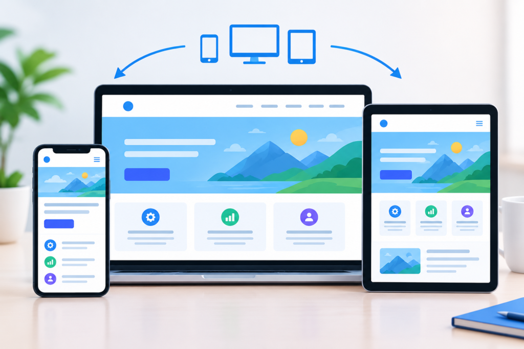
A responsive website adapts its layout and interaction model according to the device and available screen space. Visitors may use large desktop displays, laptops, tablets, smartphones, or devices with unusual aspect ratios. A successful website should remain useful and readable across these environments rather than simply shrinking a desktop design.
Responsive design begins with flexible layouts. Columns may stack vertically on smaller screens, navigation may transform into a compact menu, images may scale within their containers, and spacing may adjust according to viewport width. Typography should also be responsive so that headings remain prominent without becoming overwhelming on small screens. Components should be designed according to how content behaves rather than according to fixed screenshots.
Modern responsive design also considers different input methods. Desktop users may rely on a mouse, while mobile visitors primarily use touch. Some people navigate with keyboards or assistive technologies. Interactive controls therefore need sufficient space, clear states, and predictable behaviour. web.dev’s responsive design guidance specifically addresses different screen configurations, input mechanisms, accessibility, and responsive interface patterns. responsive design guidance
Mobile performance is particularly important because mobile visitors may use slower connections or less powerful hardware. A design that relies heavily on large video backgrounds, complex animation, enormous images, and multiple third-party scripts can become frustrating on mobile devices. Responsive design should therefore be considered together with performance optimisation.
A useful approach is to test important layouts at multiple widths throughout the design and development process rather than waiting until the end. Designers should inspect real content, not only placeholder text. Long headings, large images, lengthy product names, validation messages, and unexpected content can expose responsive weaknesses.
Google’s page-experience guidance encourages website owners to ensure that content displays well on mobile devices while also considering Core Web Vitals, security, intrusive elements, and overall usability. Responsive design is therefore not simply a visual preference; it is a fundamental requirement for modern websites.
Developing a Search-Friendly Website Architecture
Website architecture describes how pages are organised and connected. A well-structured architecture helps visitors understand where information belongs while making it easier for search engines to discover and interpret important content. The structure should normally reflect the organisation’s products, services, topics, resources, and customer journeys.
The homepage should not be treated as the only important destination. Service pages, product pages, category pages, resource articles, case studies, FAQs, and contact pages can all serve specific purposes. Important commercial pages should be accessible through logical navigation and relevant internal links. Supporting content can then provide additional context and naturally guide visitors toward related pages.
Internal linking is particularly valuable when used contextually. A paragraph discussing page performance might link to a relevant performance resource. A section explaining search visibility might naturally reference an SEO service. The anchor text should describe the destination accurately rather than relying on vague phrases such as “learn more.” Descriptive links can benefit users because they provide context before the click. web.dev similarly recommends placing meaningful language in the link itself rather than using filler text such as “here.”
Technical architecture also includes URL structure, canonicalisation, redirects, XML sitemaps, indexability, crawlability, and duplicate-content management. These elements are particularly important when redesigning an existing website because changing URLs without appropriate redirects can create broken journeys and search-discovery problems.
Structured data can also help search engines understand certain types of content. Google explains that structured data can provide information that helps its systems understand page content and may make pages eligible for certain search-result features. structured data
A search-friendly architecture should therefore be designed around people first, logical relationships second, and technical discoverability throughout the process.
Creating Content That Supports Both Users and Website Goals
Content and design work together. A website can have a beautiful interface, but if the copy is unclear, generic, outdated, or poorly organised, visitors may still leave. Conversely, excellent content can be difficult to consume when the design creates unnecessary friction. Effective Website Design therefore considers content structure at the same time as visual structure.
Every important page should have a defined purpose. A service page might explain what is provided, who it is suitable for, how the process works, what outcomes can reasonably be expected, and what the visitor should do next. An educational article should answer the question thoroughly while helping readers understand related concepts. A product page should provide accurate specifications, benefits, imagery, purchasing information, and relevant supporting details.
Headings are particularly important because many visitors scan before deciding whether to read. Strong headings create a logical path through the page. Paragraphs should generally communicate one central idea at a time, while lists and tables can simplify information that would otherwise become difficult to scan.
Content should also demonstrate genuine knowledge. Google advises creators to focus on helpful, reliable, people-first content and asks whether information demonstrates first-hand expertise, depth, originality, and a satisfying experience. This means businesses should avoid producing pages simply because a keyword appears attractive. Content should exist because it serves an audience and contributes meaningful information.
AI can assist with research, brainstorming, outlines, editing support, and repetitive tasks, but human review remains essential. Facts should be checked, examples should be relevant, claims should be supportable, and the final content should provide genuine value rather than simply expanding word count.
The strongest website copy is therefore clear, specific, useful, evidence-aware, and written for real people.
Integrating SEO Into the Website Design Process
SEO should be integrated into Website Design from the beginning rather than added after the website has already been built. Search visibility depends on many interconnected factors, including content relevance, page structure, internal linking, crawlability, indexability, technical implementation, mobile usability, performance, and the usefulness of the information provided.
Keyword research can help identify the language used by potential customers, but keyword repetition should never become the purpose of the page. A page targeting “website design services” may naturally discuss responsive design, user experience, website development, conversion optimisation, content structure, accessibility, technical SEO, and performance. These related concepts provide context without forcing the same phrase into every paragraph.
Search intent is equally important. Someone searching “what is responsive web design?” is looking for education, while someone searching “website design company” may be evaluating providers. Treating these queries as identical can produce poor content. A strong SEO strategy maps topics and keywords to the appropriate stage of the visitor journey.
Technical SEO should also be considered during design and development. Page titles, headings, descriptive URLs, image alternative text, canonical signals, internal links, crawlable navigation, structured data where appropriate, and XML sitemaps can all contribute to a technically sound site.
Google’s official guidance explains that SEO can be useful when it is applied to people-first content, rather than content created primarily to manipulate search rankings. The official Google SEO resources also cover technical requirements, Search Console, search appearance, and other optimisation considerations. Google SEO resources
The right approach is therefore not “design first, SEO later.” Instead, SEO should influence the architecture and content strategy while the design continues to prioritise usability and clarity.
A strong SEO-aware website should answer three questions:
- Can search engines discover and understand the page?
- Does the page satisfy the visitor’s search intent?
- Does the overall experience provide enough value for the visitor to trust and use the information?
When all three are addressed, SEO becomes part of a sustainable digital strategy rather than a collection of isolated tactics.
Improving Website Performance and Core Web Vitals
Website performance is one of the most important technical considerations in modern Website Design. A visually impressive website can still deliver a poor experience when pages load slowly, interactive elements respond late, or content shifts unexpectedly while the page is loading. Visitors increasingly expect websites to respond quickly, particularly when accessing pages from mobile devices or less reliable connections. Performance should therefore be treated as a fundamental part of product quality rather than a technical task that happens after the visual design is complete.
One important framework for evaluating user experience is Core Web Vitals. Google describes Core Web Vitals as a set of real-world measurements designed to evaluate important aspects of page experience, including loading performance, responsiveness, and visual stability. The current Core Web Vitals metrics include Largest Contentful Paint, Interaction to Next Paint, and Cumulative Layout Shift. Core Web Vitals These measurements are useful because they focus on experiences users actually encounter rather than relying entirely on laboratory assumptions. However, a good score should not become the sole objective of a project. A website still needs useful content, clear navigation, accessibility, security, and a strong overall experience.
Performance optimisation should begin by identifying the actual causes of slow behaviour. Large images are a common issue, especially when desktop-sized photographs are delivered to small mobile screens. Images should be appropriately sized and compressed while preserving acceptable quality. Modern image formats can also reduce file size where browser compatibility and implementation requirements allow. JavaScript should be evaluated carefully because unnecessary scripts can delay rendering or make interactions less responsive. Third-party services such as advertising systems, chat tools, analytics platforms, embedded media, and social widgets should also be reviewed because every external dependency can introduce additional requests or processing.
Caching, content delivery, server response time, font loading, CSS delivery, lazy loading, and resource prioritisation can also influence performance. Developers should avoid optimising blindly and instead use reliable performance measurements to identify the most meaningful opportunities. Google’s documentation explains that page experience is broader than Core Web Vitals alone and includes factors such as mobile usability, HTTPS, intrusive elements, and overall usefulness. page experience
A high-performance website is therefore not simply one that achieves a particular score. It is one that feels fast, remains stable, responds predictably, and allows visitors to reach useful information without unnecessary waiting.
Building Accessible, Secure, and Trustworthy Websites
Accessibility should be considered from the beginning of the Website Design process because people interact with websites in different ways. Some visitors use keyboards instead of a mouse, some rely on screen readers or other assistive technologies, and others may experience temporary limitations such as poor lighting, reduced bandwidth, an injured hand, or difficulty distinguishing certain colours. A website that is designed only around one ideal user can unintentionally exclude a significant audience.
Basic accessibility practices include meaningful heading structures, descriptive link text, appropriate alternative text for informative images, sufficient colour contrast, visible keyboard focus, accessible form labels, logical tab order, readable typography, and controls that can be operated without relying solely on a mouse. Accessibility should also apply to dynamic components such as menus, dialogs, sliders, filters, accordions, and interactive forms. The web accessibility guidance from web.dev provides practical principles for making websites more usable for people with different abilities and interaction methods.
Security is another essential part of a trustworthy website. Websites may process personal information, customer enquiries, account credentials, payments, uploaded files, or business data. Security therefore needs to be considered across hosting, software, content-management systems, plugins, APIs, authentication, backups, and administrative access. HTTPS should be used to protect connections, while unnecessary software and integrations should be removed. Administrators should use strong authentication practices, maintain software updates, and restrict access according to genuine business requirements.
Trust extends beyond technical security. Visitors should be able to identify the organisation behind a website, understand its products or services, and find legitimate contact information. Claims should be accurate and supportable. Testimonials should be genuine rather than manufactured, and important terms should not be hidden behind confusing interface patterns. Privacy information should be clear where personal information is collected.
A trustworthy website combines technical protection, transparent communication, accessible interaction, and credible evidence. These elements work together to reduce uncertainty and help visitors feel confident when deciding whether to engage with a business.
Designing Websites for Conversion Without Manipulating Users
Conversion-focused Website Design is about helping visitors complete a meaningful action when they are ready. Depending on the website, that action might be purchasing a product, submitting an enquiry, booking an appointment, requesting a quotation, registering for an event, downloading a resource, or contacting a business. Conversion optimisation should not be confused with aggressive sales tactics. The strongest conversion experiences make the correct next step easier to understand.
A clear value proposition is often the foundation of a good conversion path. Visitors should quickly understand what is being offered, who it is intended for, and why it may be relevant. A homepage or landing page should not force visitors to decode vague marketing language. Specific messaging can communicate much more effectively. Supporting evidence may include case studies, testimonials, product demonstrations, certifications, transparent processes, customer results, examples, or detailed service information.
Calls to action should also match visitor intent. A visitor who is still researching may prefer an educational resource rather than an immediate sales call. Someone who has already compared options may be ready to request a quotation. Using the same aggressive call to action everywhere can make the experience feel disconnected from the user’s needs. Contextual calls to action are often more effective because they reflect the information the visitor has just consumed.
Forms are another important conversion component. Businesses should ask only for information necessary for the next step. A simple enquiry may require a name, contact method, and message rather than a long questionnaire. Error messages should clearly explain what needs to be corrected. Mobile forms should use appropriate input types and comfortable controls so users do not struggle with typing or selection.
Conversion design should also avoid deceptive interface patterns. Misleading buttons, disguised advertisements, fake urgency, forced subscriptions, difficult cancellation processes, and unclear consent mechanisms may produce short-term actions while damaging long-term trust. Google’s page-experience guidance specifically encourages website owners to avoid intrusive elements that interfere with access to the primary content. page experience
The best conversion strategy is therefore simple: make the value clear, remove unnecessary friction, provide evidence, and make the appropriate next action easy to understand.
Developing, Testing, Launching, and Improving the Website
Website development transforms the approved design and content structure into a functioning digital product. During this stage, developers need to balance visual accuracy with maintainability, performance, accessibility, security, and future scalability. A website should not merely reproduce screenshots. It should be implemented as a coherent system of reusable components that can accommodate real content and future changes.
Semantic HTML provides meaningful structure to the page, while well-organised CSS and JavaScript can support maintainability and performance. Interactive components should be designed with accessibility in mind. Developers should also consider browser compatibility, responsive behaviour, content management requirements, integrations, forms, analytics, security controls, and third-party dependencies. Where a content-management system is used, editors should receive a practical structure that allows them to maintain content without accidentally damaging layouts or technical settings.
Testing should begin before launch day. Important tests include navigation, forms, buttons, links, menus, search, filtering, media, responsive layouts, browser compatibility, accessibility, performance, structured data, redirects, analytics, security, and content accuracy. Testing with real content is particularly important because placeholder text often hides problems. A short placeholder heading may look perfect while a real long heading creates an unexpected layout issue.
A launch checklist should also verify important technical elements. This can include HTTPS, DNS configuration, robots directives, XML sitemap availability, canonical URLs, redirects, analytics tracking, conversion tracking, backups, administrator access, forms, transactional emails, social sharing information, metadata, and indexability. Google Search Console can help website owners monitor search visibility and identify issues affecting how Google interacts with a website. Google Search Console
Launch should not be considered the end of the project. It is the beginning of the website’s operational lifecycle. After launch, teams should monitor performance, search visibility, user behaviour, conversions, broken links, security, content accuracy, and technical health. Analytics should be used to identify areas that need improvement rather than simply collecting numbers.
A successful website is therefore built, tested, launched, measured, maintained, and continuously improved.
Common Website Design Mistakes Businesses Should Avoid
One of the most common Website Design mistakes is allowing internal preferences to dominate the visitor experience. Business owners naturally understand their organisation better than outside visitors, but this can create an assumption that users already understand the terminology, services, processes, or product categories. A website should not require visitors to possess insider knowledge. Navigation labels, headings, service descriptions, and calls to action should be understandable to the intended audience.
Another common mistake is prioritising appearance over usability. Excessive animation, complicated transitions, large background videos, decorative graphics, crowded layouts, and unnecessary interactive effects can distract visitors and increase technical overhead. Design should support communication rather than compete with it. If a visual element does not improve understanding, navigation, trust, or engagement, its inclusion should be questioned.
Poor mobile design is another frequent problem. Some businesses design a desktop website and then attempt to squeeze the same interface onto smaller screens. This often creates tiny text, cramped buttons, horizontal scrolling, oversized images, and difficult navigation. Responsive design should be considered from the earliest stages, with layouts tested across different screen widths and real content.
Weak content can also undermine a technically excellent website. Pages that contain generic descriptions, repetitive keyword phrases, unsupported claims, or minimal information may fail to satisfy visitors. Google advises website owners to focus on original, helpful, reliable, people-first content rather than producing material primarily for search-engine manipulation. helpful content
Another mistake is neglecting technical maintenance after launch. Outdated plugins, broken links, expired integrations, insecure software, missing backups, and incorrect analytics tracking can gradually damage a website. Businesses should establish an ongoing maintenance process instead of assuming that a website will remain healthy indefinitely.
Other mistakes worth avoiding include:
- Using unclear navigation labels
- Ignoring accessibility
- Publishing unverified claims
- Using oversized images
- Adding unnecessary third-party scripts
- Creating too many competing calls to action
- Ignoring internal linking
- Launching without analytics
- Failing to test forms
- Changing URLs without proper redirects
- Treating SEO as keyword stuffing
- Ignoring website security
- Using intrusive pop-ups
- Failing to update outdated content
- Designing only for the newest devices
Avoiding these mistakes does not require making the website complicated. In many cases, it requires the opposite: clearer structure, better prioritisation, fewer distractions, and stronger attention to user needs.
Best Practices Summary for High-Performance Website Design
The first major best practice is to start with strategy rather than decoration. Define the purpose of the website, target audience, customer journeys, business objectives, content requirements, functionality, and measurable outcomes before designing individual pages. Create an information architecture that reflects those priorities and makes important destinations easy to find. This approach prevents the website from becoming a collection of disconnected pages.
The second best practice is to design around clarity and usability. Use understandable navigation labels, consistent components, readable typography, meaningful visual hierarchy, descriptive links, appropriate whitespace, and logical calls to action. Build responsive layouts that adapt to different screens and input methods. Treat accessibility as a core design requirement rather than a final compliance exercise.
The third best practice is to make technical quality part of the design process. Optimise images, reduce unnecessary scripts, improve caching, monitor Core Web Vitals, use HTTPS, maintain software, protect administrative access, and keep backups. Google’s official Core Web Vitals documentation provides technical information for understanding important user-experience measurements.
The fourth best practice is to create useful and trustworthy content. Write for people rather than filling pages with keywords. Demonstrate expertise where appropriate, explain concepts clearly, support important claims, and provide information that helps readers make decisions. Google’s people-first content guidance is particularly relevant when developing large content programmes.
The fifth best practice is continuous improvement. Website performance should be monitored after launch. Analytics, Search Console, user feedback, conversion data, technical audits, accessibility testing, and content reviews can reveal opportunities for improvement. A website should evolve as customer needs, technology, business objectives, and search behaviour change.
Website Design Best-Practice Checklist
Strategy
- Define clear business objectives.
- Identify the target audience.
- Map major customer journeys.
- Establish measurable KPIs.
- Research competitors and user expectations.
UX
- Use clear navigation.
- Maintain consistent interaction patterns.
- Reduce unnecessary form fields.
- Create obvious information hierarchy.
- Make important actions easy to find.
Visual Design
- Establish a reusable design system.
- Use readable typography.
- Apply colour consistently.
- Use relevant imagery.
- Preserve sufficient whitespace.
Responsive Design
- Design for multiple screen sizes.
- Test touch interactions.
- Avoid horizontal scrolling.
- Check real content at different widths.
- Optimise mobile performance.
SEO
- Create logical website architecture.
- Use descriptive URLs.
- Build contextual internal links.
- Optimise page titles and headings.
- Make important content crawlable.
- Use structured data where appropriate.
Performance
- Optimise images.
- Reduce unnecessary scripts.
- Monitor Core Web Vitals.
- Use caching effectively.
- Review third-party integrations.
Trust and Security
- Use HTTPS.
- Keep software updated.
- Protect administrator accounts.
- Maintain backups.
- Publish accurate business information.
- Handle personal data responsibly.
Conversion
- Communicate a clear value proposition.
- Use relevant calls to action.
- Provide supporting evidence.
- Simplify forms.
- Avoid deceptive interface patterns.
Frequently Asked Questions
What makes a website design successful?
A successful website combines usability, visual clarity, responsive behaviour, useful content, technical reliability, accessibility, security, SEO, and business objectives. It should help visitors accomplish their goals while supporting the organisation’s broader objectives. Visual appearance matters, but it is only one part of quality.
A professional website should make it easy for visitors to understand what the business offers, determine whether it is relevant to them, find supporting information, and take an appropriate next step. Success can be evaluated through metrics such as qualified enquiries, purchases, engagement, search visibility, task completion, and customer feedback.
How important is responsive Website Design?
Responsive Website Design is essential because visitors use a wide variety of devices. A website should adapt its layout, typography, images, navigation, and interactive elements to different screen sizes and input methods.
Responsive design also supports maintainability because businesses can manage one adaptable website rather than separate desktop and mobile versions. It should be planned from the beginning rather than added as a final adjustment.
Does Website Design affect SEO?
Yes. Design and technical implementation can affect how easily users and search engines understand and access website content. Clear architecture, descriptive headings, logical internal linking, mobile usability, accessible content, performance, crawlability, and technically sound implementation can all contribute to a stronger search experience.
However, good design alone does not guarantee rankings. Google’s guidance recommends creating useful, reliable, people-first content while maintaining a technically accessible website. Google Search Central
How often should a website be redesigned?
There is no fixed redesign schedule that applies to every business. A redesign should be considered when the website no longer supports current business objectives, user expectations, technology, brand positioning, accessibility requirements, performance standards, or content needs.
Some websites may require a complete redesign after several years, while others can remain effective through continuous improvements. Regular audits can help identify whether a full redesign is actually necessary.
What should be tested before launching a website?
Before launch, businesses should test:
- Navigation
- Internal and external links
- Forms
- Search functionality
- Responsive layouts
- Mobile usability
- Browser compatibility
- Accessibility
- Page speed
- Core Web Vitals
- HTTPS
- Redirects
- Metadata
- Structured data
- Analytics
- Conversion tracking
- XML sitemap
- Robots directives
- Important content
- Security controls
- Backup procedures
Real content should be used during testing because placeholder content can hide layout and usability problems.
How can website loading speed be improved?
Start by measuring performance and identifying the actual bottlenecks. Common improvements include reducing image sizes, using efficient image formats, eliminating unnecessary scripts, improving caching, optimising fonts, reducing third-party dependencies, improving server response time, and simplifying complex components.
Developers should also monitor performance after launch because changes to plugins, content, advertising systems, analytics tools, or third-party integrations can affect loading behaviour.
Should a website prioritise design or content?
A high-quality website needs both. Content communicates information, while design determines how easily visitors can discover, understand, and interact with that information.
Design should therefore be developed alongside content structure. Headings, paragraph lengths, images, calls to action, forms, navigation, and page layouts should all support the information being communicated.
Can AI be used for Website Design and content creation?
Yes. AI can assist with brainstorming, research, content outlines, interface ideas, code assistance, testing scenarios, and repetitive tasks. However, AI output should not automatically be treated as authoritative.
Human review remains important for factual accuracy, brand positioning, accessibility, technical quality, originality, and user value. Google’s guidance focuses on helpful and reliable content created primarily for people rather than content produced mainly to manipulate search rankings. Google’s content guidance
Conclusion
Modern Website Design is a combination of strategy, user experience, visual communication, content, SEO, responsive development, accessibility, performance, security, conversion optimisation, and continuous improvement. The strongest websites are not necessarily the ones with the most animations, visual effects, or complicated functionality. They are the websites that make it easy for the right audience to understand information, navigate confidently, trust the organisation, and complete meaningful actions.
The process should begin with a clear understanding of business objectives and audience needs. From there, the website can be structured around logical information architecture, useful content, consistent visual systems, responsive layouts, accessible interaction, and technically sound implementation.
SEO should be integrated throughout the project rather than added after launch. Search visibility is most sustainable when it grows from useful content, clear architecture, strong technical foundations, and an experience designed for real people. Google’s official guidance repeatedly emphasises the importance of helpful content and good page experiences rather than tactics designed solely to manipulate search rankings. Google Search Central
Performance should also be treated as a continuing responsibility. Core Web Vitals, accessibility, security, broken links, content accuracy, analytics, and conversion paths should be monitored after launch. Businesses should use real data to identify problems and opportunities rather than relying only on assumptions.
At MyBlogPoster, the objective should be to approach Website Design as a long-term digital growth asset rather than a one-time visual project. A website should evolve as customers change, technology develops, new content becomes available, and business objectives shift.
The best website is ultimately the one that delivers clarity, usefulness, trust, accessibility, performance, discoverability, and measurable value.
Want to Implement This Easily?
Prompt Text:
You are an expert consultant. Based on the blog post titled “(Website Design)”, provide a step-by-step, practical implementation guide. Include tools, best practices, common mistakes to avoid, and advanced tips. Assume the reader wants to implement everything discussed in this article effectively.
Call to Action: Want our help implementing this? Just reach out to us via our website contact form: contact us